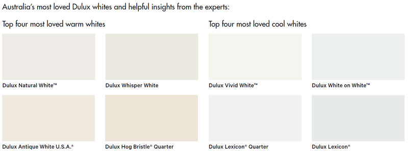
Dulux's Most Loved Whites
Dulux's Most Loved Whites
With so many different white paints on offer, choosing the right one for your home can be an overwhelming prospect.
As makers of Australia's most-loved whites, Dulux has enlisted four design experts to help Australians navigate their way through the maze of options and find the perfect white for their next painting project.
Dulux ambassadors Lucy Feagins of The Design Files, Julia Green of Greenhouse Interiors, Bonnie Hindmarsh and Lana Taylor of Three Birds Renovations, and The Real Estate Stylist's Sara Chamberlain and Amy Chamberlain-Primrose reveal in video content how they've used Australia's eight most loved Dulux whites in their work and living spaces.
'We enlisted design ambassadors who live and breathe whites, so they can arm consumers with the knowledge they need to make the selection process simple and fun - showing them how to get their white right the first time," says Andrea Lucena-Orr, Dulux's Colour Expert.
'As no two whites are the same, and with so many stunning choices available, it can be hard to know where to start when choosing one for your home."
'Warm and cool whites have different undertones and can help you set a mood within a room. Each expert explores how various elements, such as the amount of natural light your home receives and the colours of your flooring and soft furnishings, can affect the way a shade looks on your walls. It's made clear why our top eight whites are go-to's and classics for a reason," says Andrea.
 Dulux Natural White™
'Natural White™ is a warm white and its versatility spans across new and old properties, contemporary homes, as well as traditional. It is an excellent choice if you are giving your home a facelift before sale as it is easy to work with when styling with fresh plants and light coloured furniture." – Sara Chamberlain, The Real Estate Stylist
Dulux Whisper White
'Whisper White is warm, welcoming and has substance, and period properties – Victorian and Edwardian homes – benefit from this white given its depth. In a space that doesn't get much bright sunlight, Dulux Whisper White can really lift the room." – Lucy Feagins,
Dulux Antique White U.S.A.®
'Antique White U.S.A.® is my hero of all whites as it is fresh and crisp without being austere and clinical, and tends to work in most spaces despite varied conditions. A total all-rounder that never disappoints!" – Julia Green, Greenhouse Interiors Dulux Hog Bristle® Quarter
'Hog Bristle® Quarter is a beautiful warm white that has the slightest -biscuit' undertone – it has always been my go-to when creating cozy spaces. I have seen this colour work beautifully in heritage homes, but equally in spacious lofts to avoid austerity." – Julia Green, Greenhouse Interiors
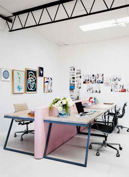
Dulux Vivid White™
'For me, I don't like a white to throw too much yellow or too much blue – so Dulux Vivid White™ is perfect as it sits in the middle. It is the purest white you can get." – Bonnie Hindmarsh, Three Birds Renovations
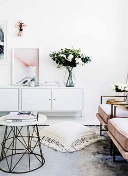
Dulux White on White™
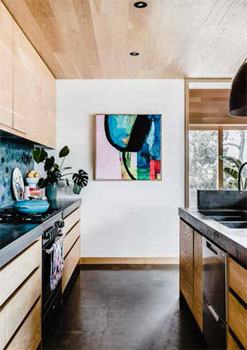
'White on White™ is a cooler-toned white that is clean and energising, suited to modern homes with timber or concrete flooring, as well as hard surface areas like the kitchen and bathroom." – Bonnie Hindmarsh, Three Birds Renovations Dulux Lexicon® Quarter
'Lexicon® Quarter is a versatile white that has a slightly blueish undertone – it is crisp, clean and bright and works beautifully in modern spaces, as well as a backdrop for colourful and eclectic art, furnishings and homewares." – Lucy Feagins, The Design Files
Dulux Lexicon®
'Lexicon® is a bold white and pairs brilliantly with timber flooring, exposed brick and polished concrete. It is a perfect shade for displaying your artwork collection or bouncing around lots of natural sunlight." – Amy Chamberlain-Primrose, The Real Estate Stylist
 Lana Taylor, Marketing Director and Bonnie Hindmarsh, Creative Director – Three Birds Renovations
Design experts and the whites they love
Question: Describe Vivid White™?
Bonnie Hindmarsh: For me, I don't like a white to throw too much yellow or too much blue – so Dulux Vivid White™ is perfect as it sits in the middle. It is the purest white you can get and is fresh and crisp.
Question: Top styling tips with Dulux Vivid White™?
Bonnie Hindmarsh: We love to layer whites and textures. If we do use pops of colour such as blush, pink and soft greys, it is introduced through artwork or furniture pieces. When we renovate, we like consistent colour throughout the space – meaning painting the same colour on the ceilings, walls and all the trims. We do change the sheen level, however, using low sheen on the walls and semi-gloss for skirting and architraves.
Question: Describe Dulux White on White™?
Bonnie Hindmarsh: Dulux White on White™ has got a touch of bluegrey, and is a cooler-toned white that isn't polarizing, as it still complements warmer colours, tones and furnishings – it's clean and energising.
Question: What kinds of homes suit Dulux White on White™?
Bonnie Hindmarsh: White on White™ is suited to modern homes with timber or concrete flooring; as well as hard surface areas like the kitchen and bathroom.
Question: Top styling tips with Dulux White on White™?
Bonnie Hindmarsh: Dulux White on White™ is perfect for the home's modern spaces, like the kitchen – To add warmth and texture to the space, style with timbers, blush-toned furniture, flowers and greenery. Given it is a clean colour, keep the styling minimalist. White on White™ also is a great colour for architraves and skirting, particularly if it is an attention-grabbing feature that contrasts against a dark wall.
Question: Choosing the right white checklist:
Lana Taylor: Paint a large swatch of your shortlisted colours on the wall – immediately all is revealed about their differences and their nuances. Ensure you look at the painted swatches in the morning, the afternoon and at night to see how the colour changes under different light conditions.
We only put Dulux tint into a Dulux paint, otherwise you are taking a gamble with the outcome if you mix and match tints and brands.
Julia Green, Stylist, Writer, Presenter and Director of Greenhouse Interiors
Design experts and the whites they love
Question: Describe Dulux Antique White U.S.A.®?
Julia Green: Dulux Antique White U.S.A.® is my hero of all whites as it is fresh and crisp without being austere and clinical, and tends to work in most spaces despite the varied conditions. A total allrounder that never disappoints! I love it for its versatility.
Question: Why do you love Dulux Antique White U.S.A.®?
Julia Green: This colour translates across all home styles with ease. It is a welcoming white that loves heritage homes, but can work well in contemporary homes also. In bright north-facing sun it can throw off the warmer -yellow' hues, making the finish look a little creamier, so this should be considered when selecting it. If you have low ceilings it would be a good idea to paint the walls and ceiling the same color, so it opens the space and takes away attention from the low ceiling
s.
Question: Top styling tips with Antique White U.S.A.®?
Julia Green: 1. Given its warmth, Dulux Antique White U.S.A.® use looks great with cooler substrates, such as natural stone and concrete. It warms the space up to avoid it looking -lab-like'!
2. Antique White U.S.A.® works with all colours so you are not limited at all!
3. Floor boards with -orange or yellow' tones will throw off those colours onto the walls, be warned of this, and trial a test patch to be sure you like the overall finish before painting the whole room.
4. Think about your artificial lighting plan, and remember you can change globes to warm or cool. If you have warmer globes, and a warmer white the room can feel creamier with a soft yellow glow. Therefore, if you are after a crisper finish, try a cooler globe to offset the warmth.
5. Try generous test patches to avoid time consuming and costly mistakes.
Question: Describe Dulux Hog Bristle® Quarter?
Julia Green: Dulux Hog Bristle® Quarter is a beautiful warm white that has the slightest -biscuit' undertone – it has always been my go-to when creating cozy spaces.
Question: Why do you love Dulux Hog Bristle® Quarter?
Julia Green: I love the gentle warmth that Hog Bristle® Quarter exudes. The warmth is subtle, and doesn't tend to throw off excess yellow, so it feels inviting and welcoming. I don't think this colour should be pigeon holed for one type of home style – it is more about the feeling one wants to create when in the space that should dictate the chosen colour. I have seen this colour work beautifully in heritage homes, but equally in spacious lofts to avoid austerity. It tends to keep the space open and fresh, but in no way is it clinical with those warmer undertones.
Question: Top styling tips with Dulux Hog Bristle® Quarter?
Julia Green: 1. I do love a wall and ceiling in the same tone. The space becomes united and considered when trims, walls and ceilings are painted in unison. I find different coloured skirts for example, divide the room.
2. Avoid gloss; matt finishes look less -showy'.
3. Always add texture. Dulux Hog Bristle® Quarter loves warm friends, such as fur, chunky knits, natural leathers and latte coloured accessories.
4. Consider the amount of natural light that enters the room. Hog Bristle® Quarter can look significantly darker without much light, and conversely can look a little cream if in too much light. And either of those are fine if that is the desired look, but always carefully consider this before committing, and of course, trial a test patch and watch it at all times of the day to ensure you are going to enjoy living within it!
5. Oh, and trial a big patch, as small patches don't cut it! It's too hard to imagine the colour properly on a brush out board – paint on a big surface area to get a better gauge of the colour.
Question: What do people need to keep in mind when selecting white paint?
Julia Green: Choosing the right white paint can be overwhelming, as there are litera
lly hundreds of whites to select from! And viewing them and their subtleties on a tiny swatch – and then imagining them on the walls – can be a near impossible task for many.
Not all whites are created equal and they can completely change the way a room feels!
So you need to think about how you want to feel in the space first and foremost. Then consider your surrounds and the amount of natural light that enters your space. Cool whites have a blue/black base, and translate as sharp, fresh, crisp and contemporary on the walls. They also neutralise natural sunlight so work well in north facing rooms where sunlight is at its peak; whereas warmer whites have a yellow/brown base and throw off warmer hues making a room feel cozier.
Choosing the right white checklist:
Always always trial a generous test patch first.
Speak to the professionals about the nuances of white as they are experts in their field and can share the ins and outs of each choice with you.
How do you want to feel in the space? This will dictate your color choice in the biggest way and help you decide between cool and warm whites based on their different properties.

Amy Chamberlain-Primrose and Sara Chamberlain – The Real Estate Stylist Founders and Creative Directors
Design experts and the whites they love
Question: Describe Dulux Natural White™?
Sara Chamberlain: Dulux Natural White™ is a neutral warm white with a classic ivory tone. Natural White™ makes friends with just about anyone. She is gentle in nature and rather easy on the eyes. Natural White™ evokes feelings of peace and comfort.
Question: Why do you love Dulux Natural White™?
Sara Chamberlain: We love Dulux Natural White™ because it is the perfect warm white that works in so many different spaces. Its versatility spans across new and old properties, contemporary homes as well as traditional. Natural White™ is a great choice of colour to update a room or property as it sits nicely in the middle of warm and cool whites and is easy to work with.
Question: Top styling tips with Dulux Natural White™?
Sara Chamberlain: 1. When using a low sheen Natural White™ for your walls, consider using a half strength semi-gloss on your window frames, doors and skirting to create a point of interest and add subtle layers to the room.
2. Consider painting your walls and a piece of furniture that is flush against the wall, in the same Natural White™. This creates a beautiful backdrop to display textural items, such as throw rug on a white (painted) chair or a collection of books or records on a painted book shelf.
3. The best way to know if Natural White™ will work in your space is to take home a sample pot and give it a test run on your walls. This way you get to experience the colour in your home and at all times of the day when the light is shifting.
4. When selecting furnishing for a Natural White™ space look towards soft beach tones and texture. Beige, ivory, white, latte and linen will all feel right at home hanging out with the soft Natural White™.
5. Natural White™ is an excellent choice if you are giving your home a facelift before sale – it will create a strong base for fresh plants and lighter furniture.
Question: Describe Dulux Lexicon®?
Amy Chamberlain-Primrose: Dulux Lexicon® is a bold white with a blue undertone. Lexicon® can be bold and confident when he wants to be and loves to hang out with his friends – timber flooring, exposed brick, and polished concrete. A space-changing kind of guy, Lexicon® demands your attention when he enters the room. He is perfect for displaying your artwork collection or bouncing around natural night.
Question: Why do you love Lexicon®?
Amy Chamberlain-Primrose: We love Dulux Lexicon® for its lack of colour – it's pure white at its best. Lexicon® tends to work best in bright properties. Its cooler tones require lots of light to brighten and warm it up. Lexicon® evokes feelings of calm and tranquility when used correctly.
Question: Top styling tips with Dulux Lexicon®?
Amy Chamberlain-Primrose: 1. If using Dulux Lexicon® as a colour to update your property, make sure you also paint the windows, skirting and doors in semi-gloss of the same colour or in a half strength. Leaving these as the existing colour will leave you with a scheme that isn't unified and Lexicon® isn't very forgiving on older, creamy whites. As we said, he's picky with his friends…
2. If choosing carpet to go with Lexicon® walls, stick with a grey or ash and avoid cream or brown carpets.
3. Consider the big picture when selecting Lexicon®; what colour is your kitchen cabinetry, wardrobes, tiling, flooring, blinds, carpet etc. And will you be changing any of these as well as painting?
For example, keeping a creamy white kitchen and painting the kitchen walls in Lexicon® is going to create a clash of warm and cool and sometimes these things are overlooked when selecting your paint.
4. If you're seeking to work with exposed bricks, exposed ceiling beams or industrial elements Lexicon® will contrast perfect with these earthy tones and make sure they are contemporary and not dated.
5. If you're in love with classic monochromatic palettes with a heavy use of black and white you can't go past Lexicon®!
Question: What do people need to keep in mind when selecting white paint?
Sara Chamberlain: Don't fall into the trap of trends when choosing a white. Think about your house and the space you are selecting the white for.
If you have a light and bright space with a cooler colour scheme in carpet or cabinetry, then a cooler white may be for you.
If you want to add some warmth to an older property that has a warmer scheme, such as cream carpet or tiling, then perhaps a warm white is the way to go. Think of your white as the backdrop to the rest of your house.
 Lucy Feagins, The Design Files Founder and Editor
Design experts and the whites they love
Question: Describe Dulux Lexicon® Quarter?
Lucy Feagins: Dulux Lexicon® Quarter is a versatile white that has a slightly blueish undertone – it is crisp, clean and bright. I have used the colour in my home, in my art gallery and in my work space; I spend a lot of time with Lexicon® Quarter.
Question: Top styling tip with Dulux Lexicon® Quarter?
Lucy Feagins: I find that if your taste in furnishings, homewares and art is colourful and eclectic, then a crisp bright white such as Dulux Lexicon® Quarter is a great foundation to build that sort of interior.
Question: Describe Dulux Whisper White?
Lucy Feagins: Dulux Whisper White is a white that is warm, welcoming and has substance to it.
Question: What home styles suit Dulux Whisper White, and how is the colour versatile?
Lucy Feagins: Period properties (such as Victorian and Edwardian homes) often benefit from a white with some depth, such as Dulux Whisper White.
Warm whites typically have yellowish undertone so they can look a little creamy. They enhance the warmth of sunlight, so if you have a very bright space, you may prefer to counteract that with a cooler white.
However, in a cool space which does not get much bright sunlight, a warmer white can really lift the room.
Question: Top styling tip with Whisper White?
Lucy Feagins: Whisper White works well with natural materials, such as untreated, treated or distressed timbers, and layers of textural soft furnishings in neutral tones.
Question: What kinds of spaces suit a warm and cool white?
Lucy Feagins: At The Design Files, we photograph homes every week, so I am always in a different home and exposed to varying styles. It is clear where certain whites work best.
Generally, I like bright, slightly blueish-toned whites in contemporary, open plan and industrial spaces. I find warmer whites are better suited to older spaces with period character, such as Victorian or Edwardian homes.
Choosing the right white checklist:
My advice is to always use a sample pot or a brush out; bringing your two to three favourite whites into the space you intend to paint, comparing them in the light at different times of the day.
Also, it's not just about the colour of the paint, it is also about the texture of the paint, how many coats is it going to need and the way it reflects light. It's important that you trust the paint that you are working with.
To learn more from the experts and about Dulux's most loved whites and styling tips, visit: www.dulux.com.au/mostlovedwhites or call 13 25 25


MORE